
This is really exciting and I want to talk about why from my personal perspective.
To be transparent, I work for Capacities. I used and loved the app long before I started working for them. All opinions here are my own and I have not been asked to make this content, nor am I being paid by the company to do it.
What are page layouts
Capacities’ objects are made up of two things
Properties (at minimum, title, tags and blocks)
Blocks (technically a property, but it’s just where you write)
The page layouts change how these are configured in the page in front of you, and how large the actual page is.
The four types of page layouts are
Standard
Index
Profile
Encyclopedia
If you want to see what these look like generally, the docs page is useful but here are some examples from my system.
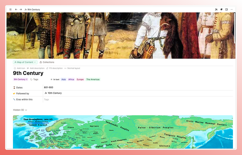
Standard
This is what I use for my Maps of Content object. I don’t want many properties here but I want some to be easily viewable. It’s easiest in this form.
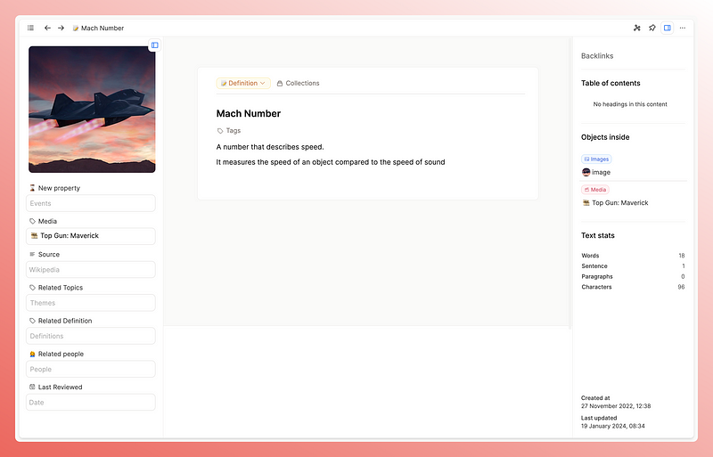
Index
These are cute little cards that are perfect for snappy pieces of information. I have my atomic ideas and definitions as index cards, to remind me that this isn’t the place for long work.
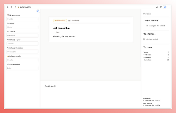
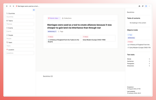
I don’t really use the properties much in these at the moment- the focus is on the content in the centre.
Profile
I personally don’t use this one in my main space, as I prefer the next page layout, but it does look very impressive here in my demo space.
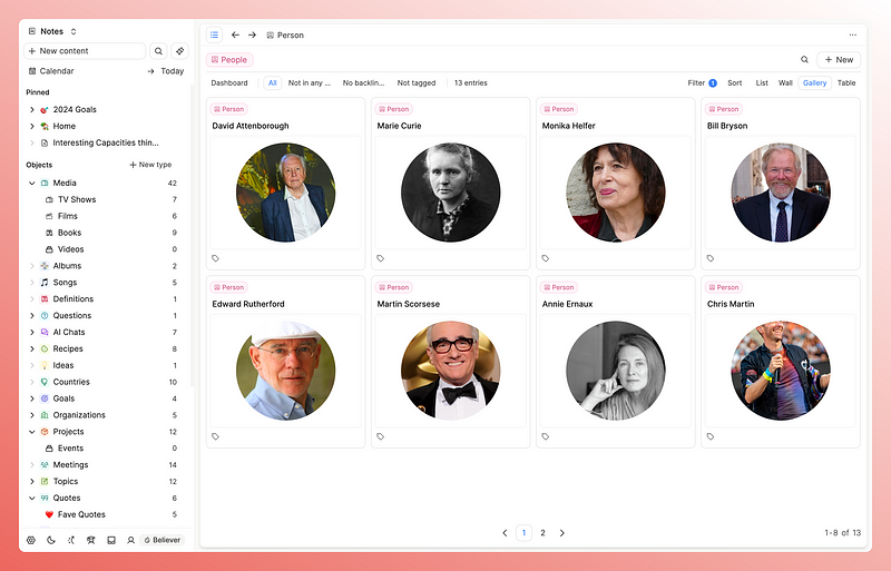
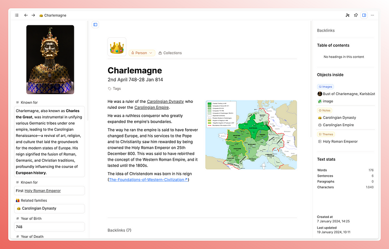
Encyclopedia
I’ve saved the best til last. This is my favourite layout which I have this on most object types because I want a lot of information in front of me, and this is the best layout for this.
Why is this good?
One of the reasons I first went to Capacities was repeated structure. I was tired of trying to remember what properties I wanted to track for each type of note I was creating. Imagine my glee when I found out that Capacities is set up to let you do just that with its object types. So it solved that immediate issue.
But I was also bored of the blocks in Logseq. I wanted to use the whole page in front of me rather than being forced to work in an outline.
That’s not to say that outliners are bad- they are very valuable, but having a list of bullet points be the only option for my notes started to feel boring and uninspiring
I felt that if my notes are where I have the most fun, most curious, most at peace version of myself, then frankly I don’t want to be looking at a list of bullet points.
I want my notes to be visually engaging and I already find the overall vibe of Capacities to be much more aligned with my visual preferences, but the page layouts take it to another level. I haven’t seen this anywhere else, certainly not in apps I’ve used or researched.
It makes total sense to me as a feature though, the idea that your page can physically look a certain way based off the information it holds seems a very natural extension of the object-based note-taking that Capacities creates.
It’s also worth pointing out the difference with this and templates.
Templates in Notion and in Capacities are dealing with what the blocks look like, as in what your notes look like within the page. You can also pre-fill in properties.
But these page layouts adjust the whole structure of your page. Then you can add in templates too if you wish!
Then, once you choose the layout of an object type (e.g. all definitions to have the index card, all people to have the encyclopaedia layout), it’s repeated in every instance of that type and you never even have to think about it. It’s frictionless.
An example
Take the example of a definition vs a person.
The point of having a definition object is to hold simple information. The shorter the definition, the more likely I am to understand and remember it. I haven’t defined it very well if I need three paragraphs to understand it.
The index card layout is therefore perfect for this as it shortens the page and focuses you on the centre of the screen.
In hindsight I should have worked this out from watching the film, but alas…
Conversely, with my notes on historical people, I want to see the information I hold in properties.
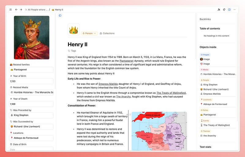
If I’m bothering to create so many properties, it’s because I want to see them, but I don’t want them to be the only thing I see.
This is the problem with the standard view, and the database views in Notion, which I use extensively. Yes you can hide properties, but it’s still linear where I’m forced to scroll up and down the screen. I guess this is kind of the same problem I had in Logseq, I like to use the whole page.
So given all this, perhaps it’s not surprising that the encyclopedia view is my favourite. It moves the properties to the side of the screen, and therefore gives me the whole middle section of the page to work with. This is perfect for my preferences. I don’t need to worry about the standard view not being perfect for all use cases, I have options!
Summary
The more I use Capacities, the more I realise that fully embracing object-based note-taking with all the settings you can configure for them, is perfect for my brain.
I think in categories, so being able to customise how I interact with them just makes more sense to my brain and ups the enjoyment factor of using the app significantly.
Page layouts are a significant factor here because it’s what I’m physically seeing when taking notes, so I think this is a great feature.
I hope this article has given you some ideas of how you might be able to use this newly free feature 🙂
Have you explored this newly free feature yet? How do you use page layouts? Which is your favourite?
If you liked this post you’ll probably like my newsletter too, I send it out every 2 weeks and talk about fun things like PKM and digital systems. You can sign up and browse through old content here: www.pkmbeth.com
See you there!